Brand
Guidelines.
Everything you need to represent Lapsite. Download official logos, brand assets, and follow our usage guidelines.
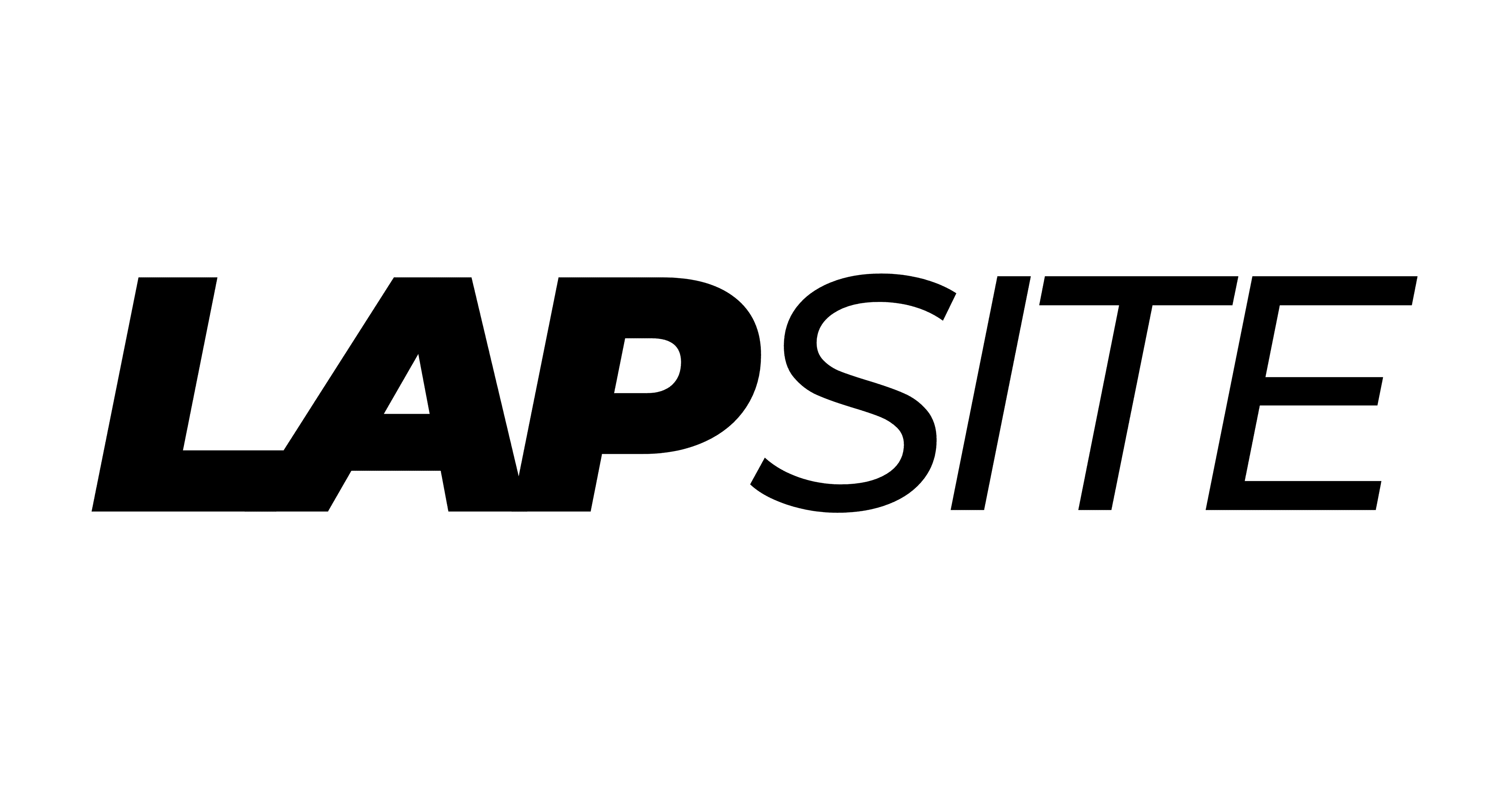
Lapsite Full Logo (Dark)
Primary logomark. Best for light backgrounds and general use.
Lapsite Full Logo (Light)
Primary logomark. Best for dark backgrounds and imagery.
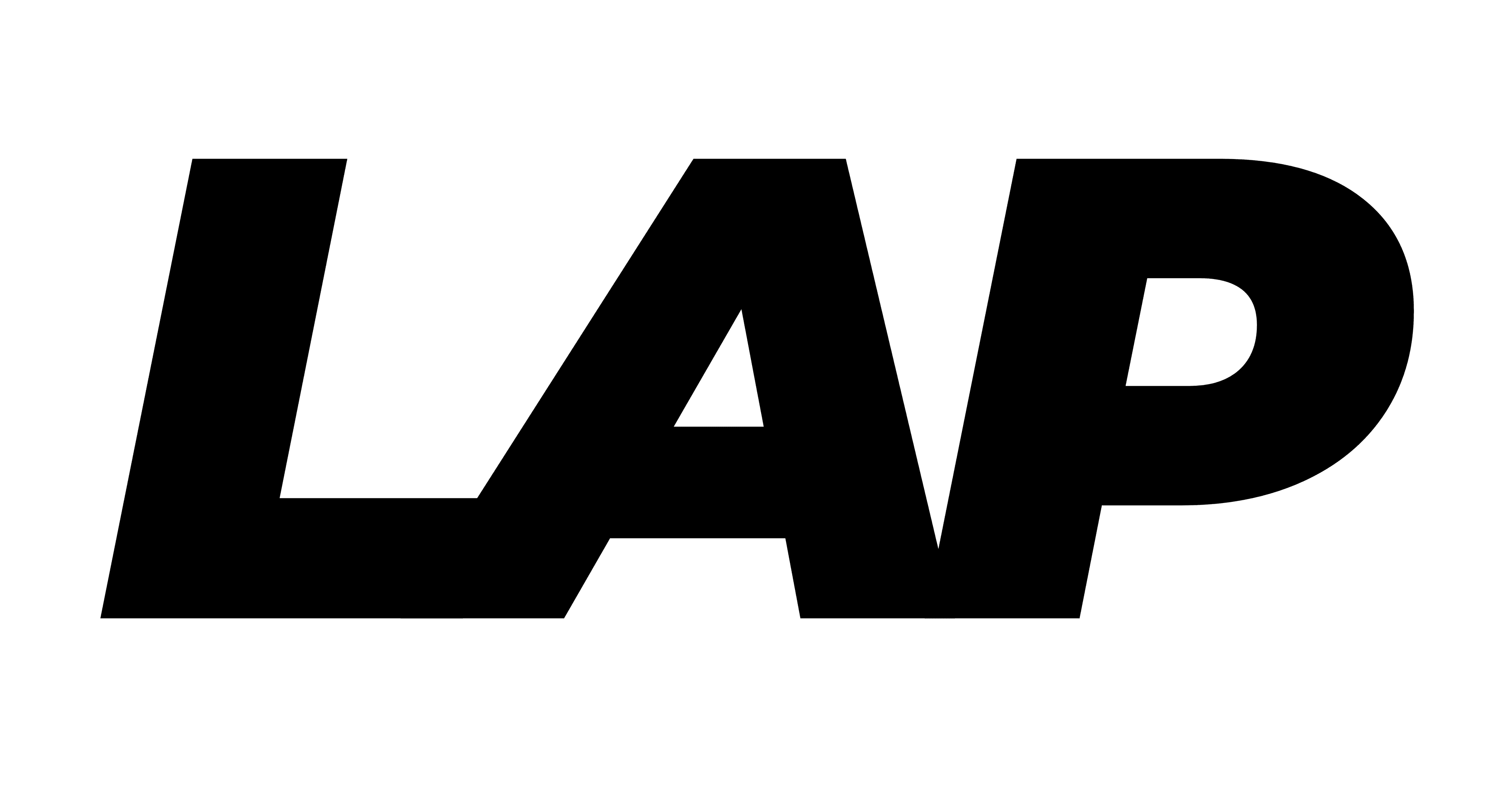
LAP Monogram (Dark)
Compact logomark. Use when space is limited.

LAP Monogram (Light)
Compact logomark. Use when space is limited on dark backgrounds.
02 / Usage
Name & Spelling
Lapsite is always written as a single word with a capital "L". Never write it as "LapSite" (CamelCase) or "Lap Site" (two words).
Clear Space
Always maintain a generous amount of clear space around the logo. Do not place other graphics, text, or elements too close. The minimum clear space should be equal to the height of the "L" in Lapsite.
Color Contrast
Use the light logo strictly on dark, contrasting backgrounds. Use the dark logo on light backgrounds. Never overlay the logo on busy photographic backgrounds without sufficient contrast.
Proportions
Never stretch, skew, or distort the logo in any way. Always scale the logo proportionally. Do not attempt to recreate the logo typographic mark manually or alter the letterforms.
03 / Colors
Lapsite Black
Lapsite White
Need something specific or a different format?